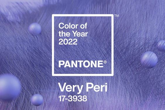
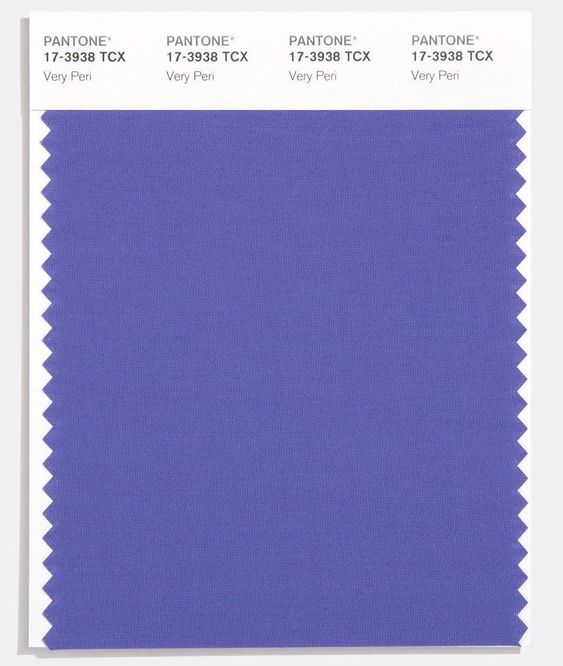
ANNOUNCING THE PANTONE COLOUR OF THE YEAR 2022
PANTONE 17-3938 Very Peri
We always kick off a new year with a design exploration and following on from the last few years, we thank PANTONE Lab once again for giving us our inspiration springboard for launching. Happy NY 2022 to you all.
PANTONE have explained more on Very Peri from their design institution :
“Displaying a carefree confidence and a daring curiosity that animates our creative spirit, inquisitive and intriguing PANTONE 17-3938 Very Peri helps us to embrace this altered landscape of possibilities, opening us up to a new vision as we rewrite our lives. Rekindling gratitude for some of the qualities that blue represents complemented by a new perspective that resonates today, PANTONE 17-3938 Very Peri places the future ahead in a new light.”
“We are living in transformative times. PANTONE 17-3938 Very Peri is a symbol of the global zeitgeist of the moment and the transition we are going through. As we emerge from an intense period of isolation, our notions and standards are changing, and our physical and digital lives have merged in new ways. Digital design helps us to stretch the limits of reality, opening the door to a dynamic virtual world where we can explore and create new colour possibilities. With trends in gaming, the expanding popularity of the metaverse and rising artistic community in the digital space PANTONE 17-3938 Very Peri illustrates the fusion of modern life and how colour trends in the digital world are being manifested in the physical world and vice versa.”

“Encompassing the qualities of the blues, yet at the same time possessing a violet-red undertone, PANTONE 17-3938 Very Peri displays a spritely, joyous attitude and dynamic presence that encourages courageous creativity and imaginative expression.”
“The Pantone Colour of the Year reflects what is taking place in our global culture, expressing what people are looking for that colour can hope to answer.” added Laurie Pressman, Vice President of the Pantone Colour Institute. “Creating a new colour for the first time in the history of our Pantone Colour of the Year educational colour program reflects the global innovation and transformation taking place. As society continues to recognise colour as a critical form of communication, and a way to express and affect ideas and emotions and engage and connect, the complexity of this new red violet infused blue hue highlights the expansive possibilities that lay before us”.

CLICK here to take you directly to the Pantone Colour laboratory where you can work on harmonising with very peri
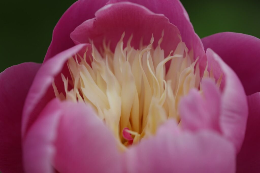
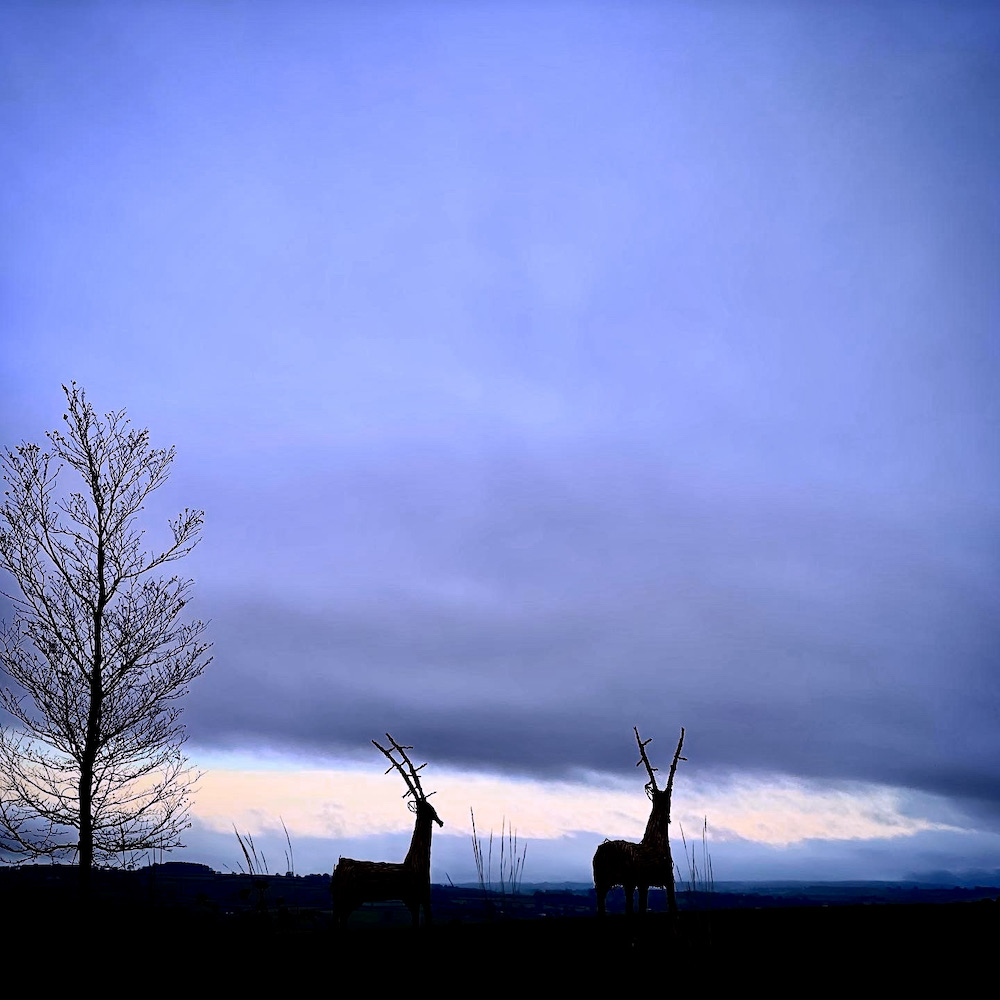
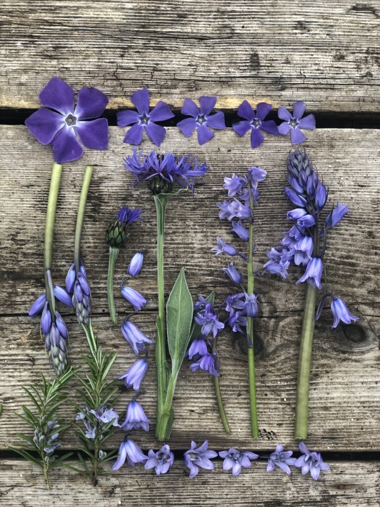
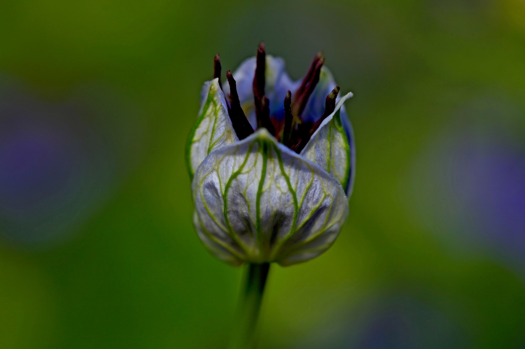
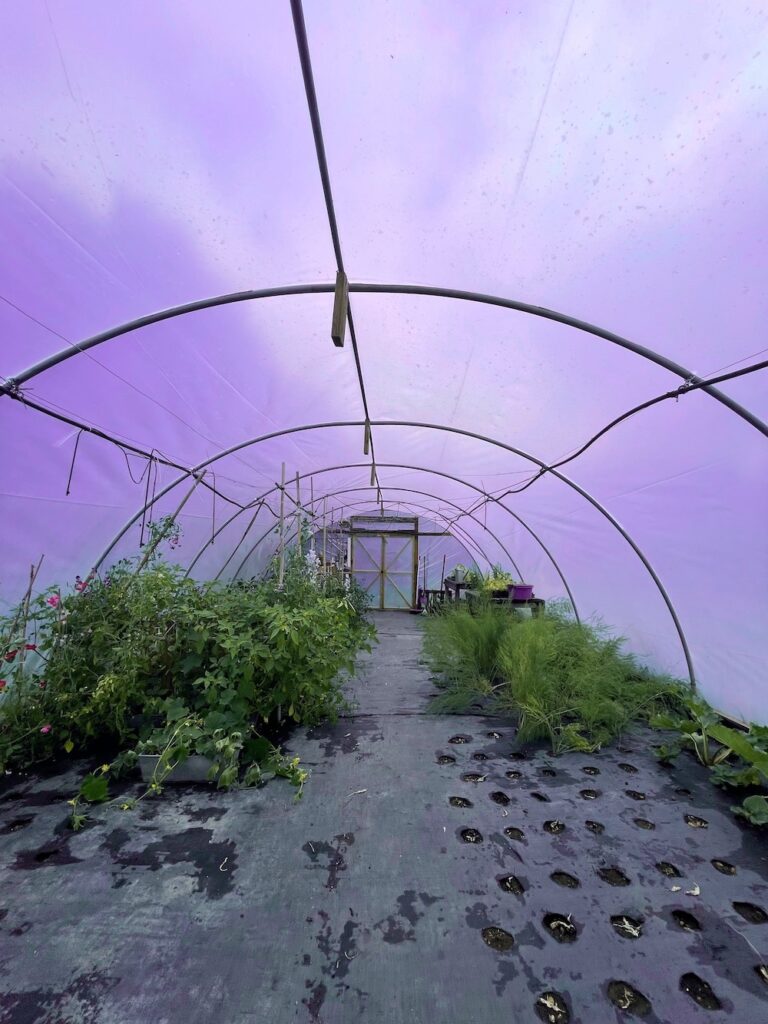
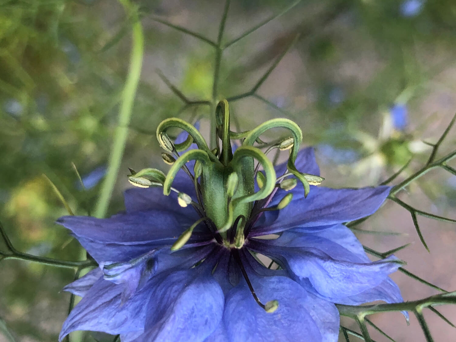
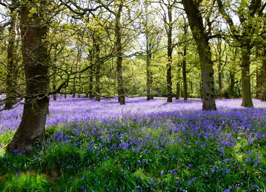
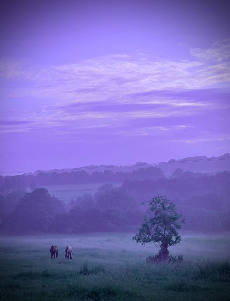
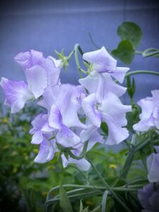
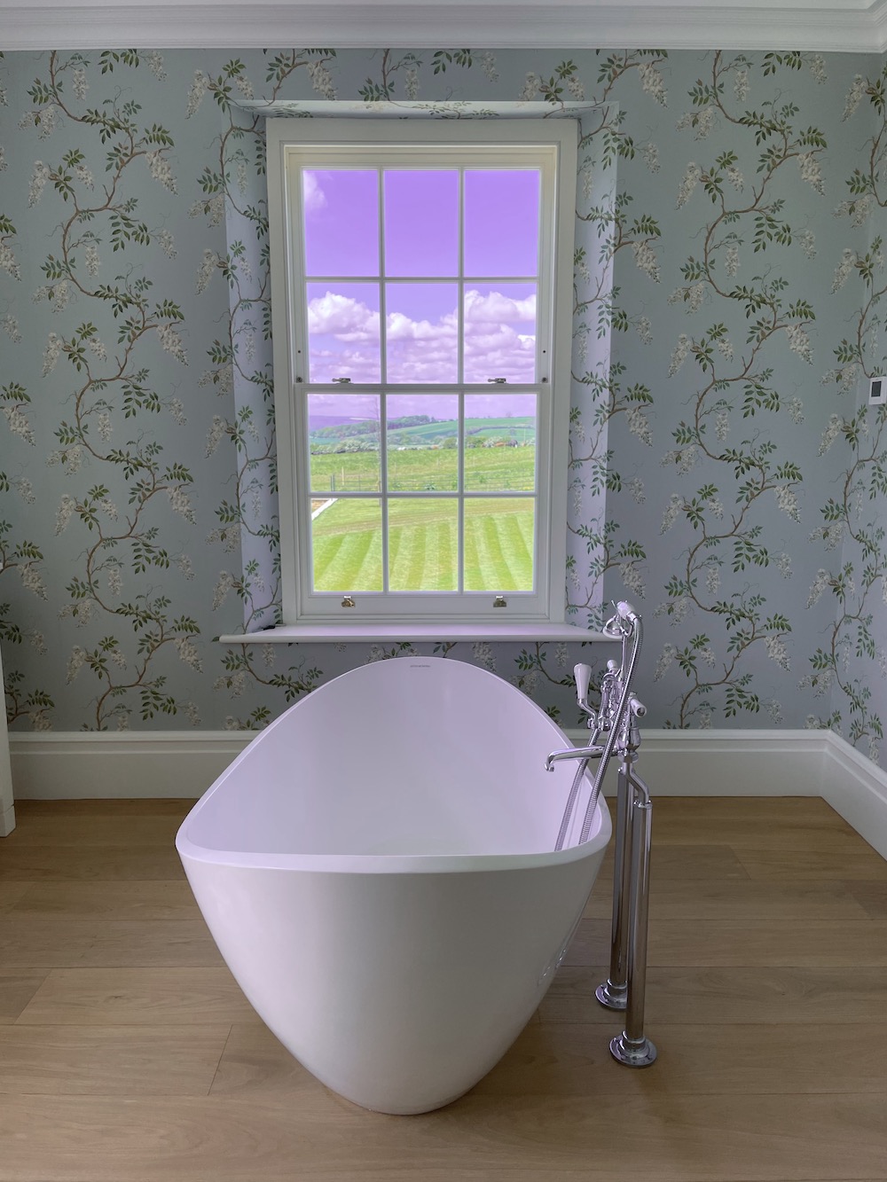
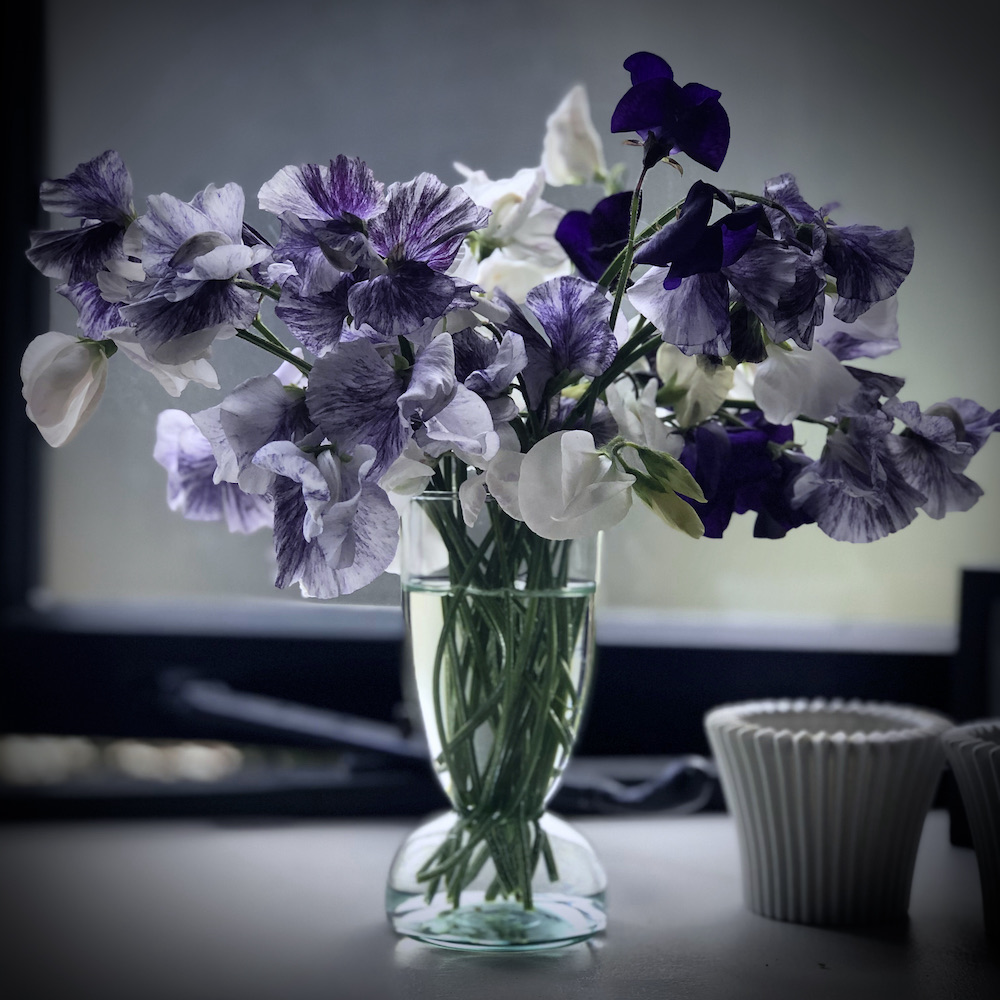
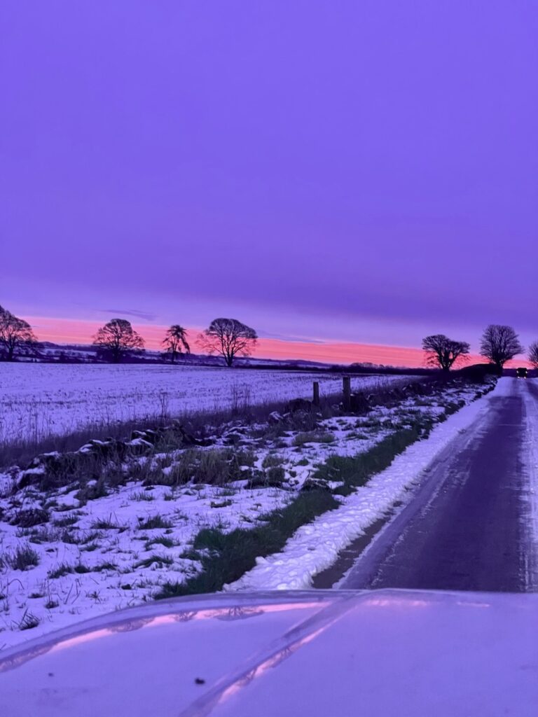
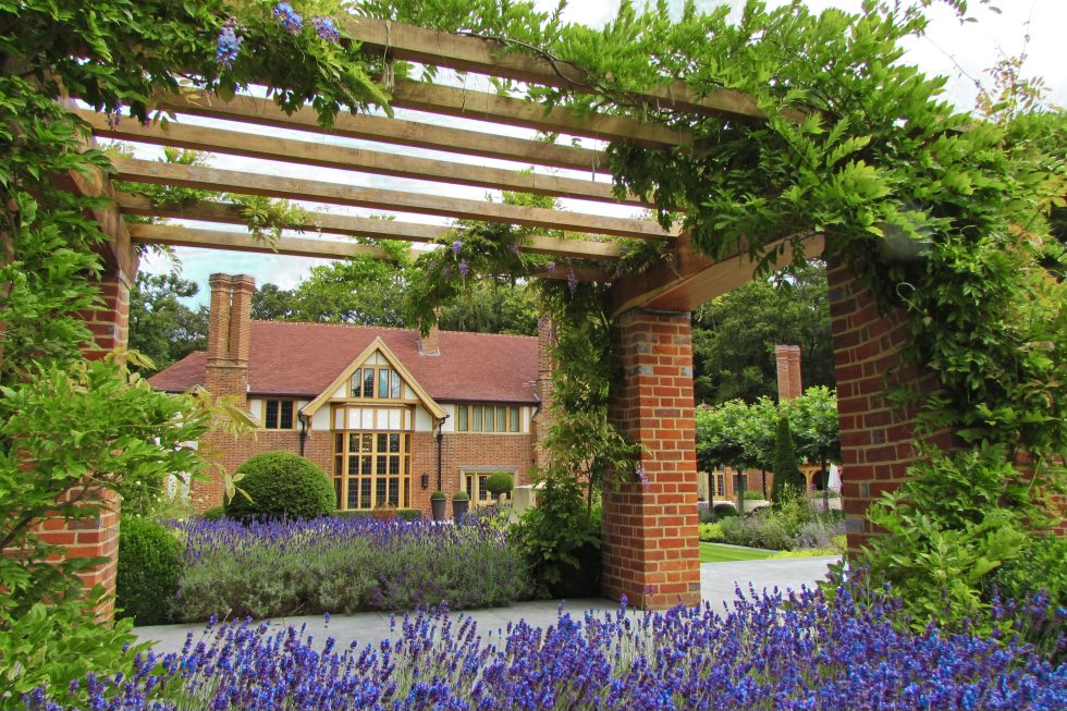
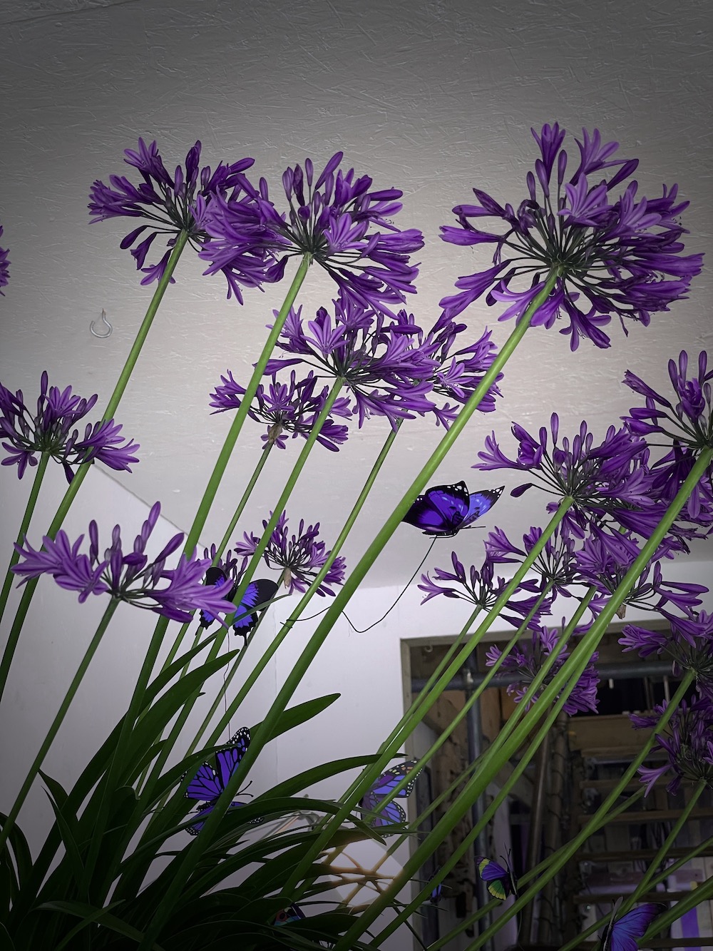
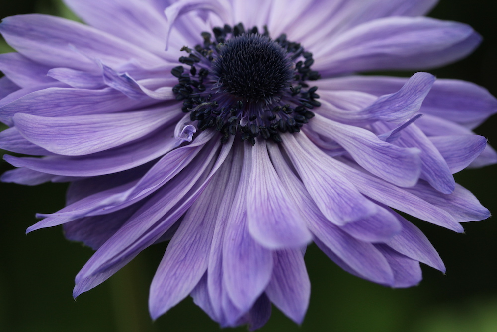
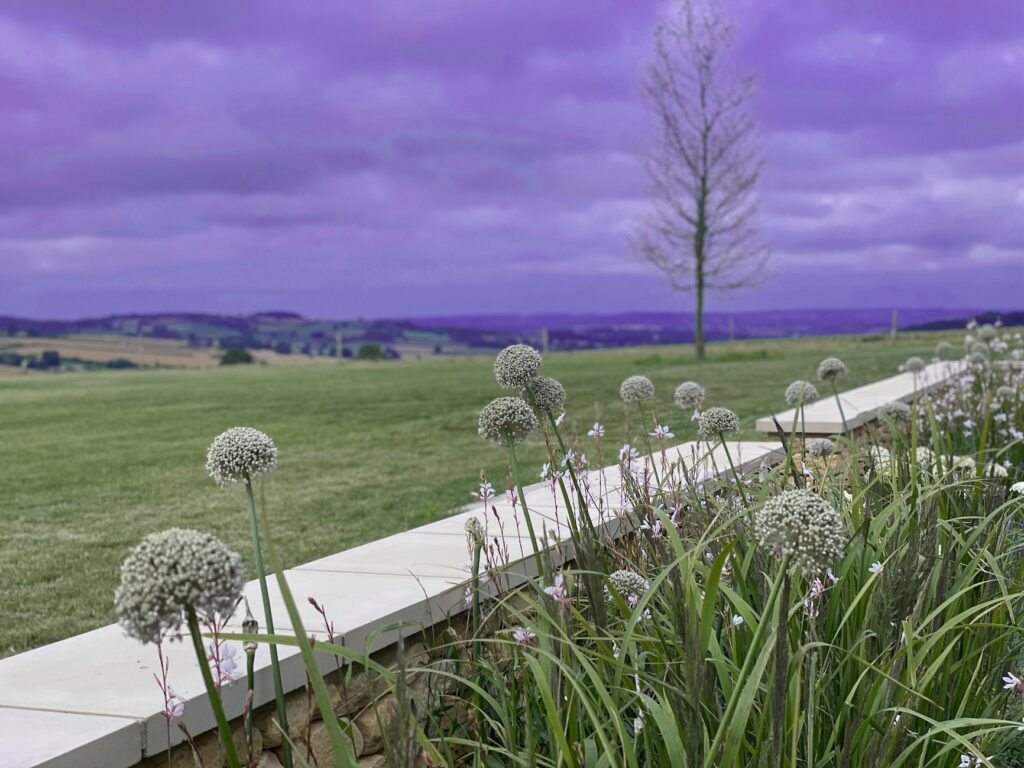
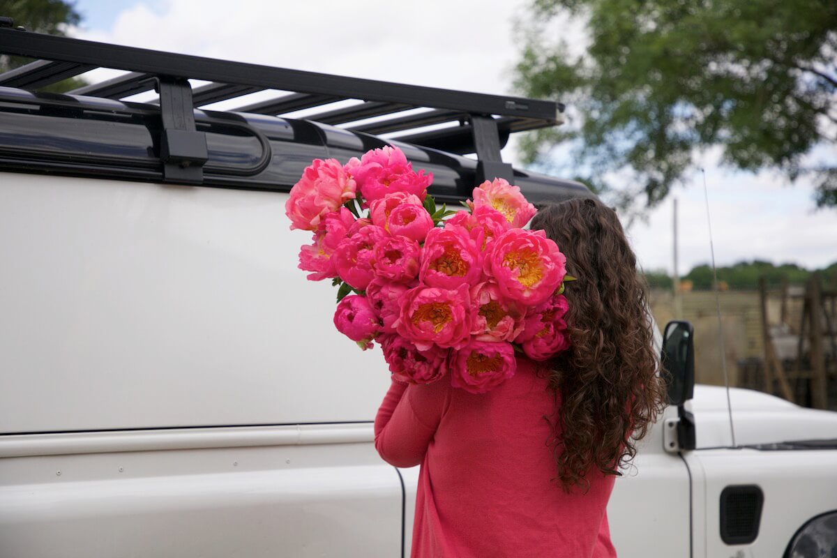
STICK with us to see very peri in context of gardens, grounds, landscapes and florals
harmonies
wellspring

amuse

trend
balance
you might also like
for El